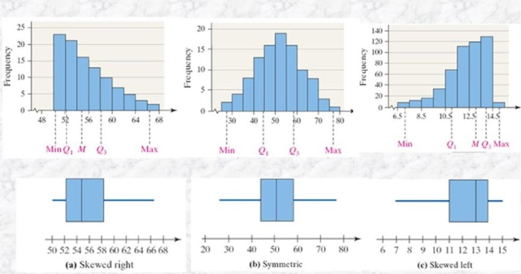
Histogram
A histogram serves as a cornerstone in discerning the distribution of numerical data. It presents the frequency or proportion of data points within predefined intervals, depicted as bars of varying heights. By delineating the shape, central tendency, and dispersion of the data, histograms unveil underlying patterns, anomalies, and potential data irregularities.
Interpretation: Understanding a histogram entails decoding its visual cues to derive insights into the data’s distribution characteristics. A symmetrical bell-shaped histogram indicates normality, while skewed distributions suggest departures from normality, necessitating further investigation. Moreover, the presence of outliers or gaps between bars may signify data anomalies or measurement errors, prompting data cleansing or refinement processes.
Additionally, histograms can exhibit different peak shapes, known as kurtosis, which provide further insights into the distribution’s characteristics:

Mesokurtic: A mesokurtic distribution represents a normal distribution with moderate kurtosis. In this scenario, the histogram’s peak is relatively symmetrical, resembling a bell-shaped curve. Mesokurtic distributions are indicative of moderate central tendency and dispersion, aligning closely with the properties of a normal distribution.
Leptokurtic: A leptokurtic distribution is characterized by a pronounced peak and heavy tails, indicating higher kurtosis than a normal distribution. In this case, the histogram’s peak is sharper and more concentrated, with data points clustered closely together. Leptokurtic distributions signify increased central tendency and peakedness, suggesting higher probability of extreme values or outliers in the dataset.
Platykurtic: A platykurtic distribution exhibits a flatter peak and lighter tails compared to a normal distribution, indicating lower kurtosis. In such distributions, the histogram’s peak is broader and less pronounced, with data points dispersed over a wider range. Platykurtic distributions suggest decreased central tendency and peakedness, with data points exhibiting greater variability and dispersion.
By discerning the kurtosis of a histogram, analysts can glean insights into the distribution’s shape, central tendency, and variability, facilitating informed decision-making and data-driven insights.
Box Plot
The box plot, or box-and-whisker plot, encapsulates a succinct summary of numerical data distribution through quartiles. It comprises a box delineating the interquartile range (IQR), flanked by whiskers extending to the minimum and maximum values within a specified range. Box plots serve as efficient tools for comparing distributions, identifying outliers, and gauging variability and central tendency.
Interpretation: Deciphering a box plot entails extracting insights into the data’s spread, central tendency, and outlier presence. The length of the box denotes the variability within the middle 50% of the data, while the median line indicates the data’s central tendency. Outliers, represented as individual points beyond the whiskers, may signify extreme values or data anomalies warranting further scrutiny.


- Cook’s D: Cook’s D gauges the impact of each observation on regression coefficients in a linear regression model. Elevated Cook’s D values suggest influential observations that may exert disproportionate influence on the model’s parameters, signaling potential outliers or influential data points.
Interpretation: Analyzing Cook’s D values involves assessing the magnitude of influence exerted by individual observations on the regression coefficients. Observations with high Cook’s D values may necessitate closer scrutiny to discern their impact on model accuracy and robustness.
- QQ Plot (Quantile-Quantile Plot): A QQ plot juxtaposes the distribution of a dataset against a theoretical distribution, such as the normal distribution. Deviations from the diagonal line in a QQ plot indicate deviations from the assumed distribution, hinting at potential outliers or non-normality in the data.

Interpretation: Interpreting a QQ plot involves scrutinizing deviations from the diagonal line, which may signify departures from the expected distribution. Outliers or data points deviating from the line may require further investigation to ascertain their significance and potential implications on subsequent analyses.
- Residual vs Predicted Plot: This plot assesses the homoscedasticity assumption in regression analysis by plotting residuals against predicted values. Patterns or trends in the plot may indicate violations of the assumption, necessitating model adjustments or transformations.

Interpretation: Examining the residual vs predicted plot entails identifying patterns or trends, which may indicate heteroscedasticity or non-constant variance. Such deviations from homoscedasticity may warrant model diagnostics and remedial actions to ensure the robustness and reliability of subsequent analyses.
- DFFITs and DFBETAs: DFFITs and DFBETAs quantify the influence of individual observations on fitted values and regression coefficients, respectively. Large values of DFFITs or DFBETAs suggest influential observations that may impact the model parameters, indicating potential outliers or influential data points.

Interpretation: Analyzing DFFITs and DFBETAs involves scrutinizing the magnitude of influence exerted by individual observations on model parameters. Observations with pronounced influence may necessitate closer examination to discern their impact on model accuracy and reliability.
- ROC Curve (Receiver Operating Characteristic Curve): The ROC curve evaluates the performance of binary classification models across different threshold values. The area under the ROC curve (AUC) quantifies the model’s discriminatory power, with higher AUC values indicating better predictive accuracy.

Interpretation: Interpreting the ROC curve entails assessing the AUC value, which quantifies the model’s discriminative ability. Higher AUC values signify superior model performance in distinguishing between positive and negative cases, indicative of robust predictive accuracy.
Statistical diagnostic plots serve as indispensable tools in unraveling the intricacies of datasets, offering insights into data quality, assumptions, and potential anomalies. By harnessing the descriptive and interpretative power of histograms, box plots, and various outlier diagnostic plots, analysts can navigate through complex datasets with confidence, ensuring the reliability and validity of their analyses