Introduction to Descriptives
Statistical techniques aim to interpret data characterized by random fluctuations or uncertainty. Without any variation in your data, statistical analysis becomes unnecessary. This section delves into the concept of Random Variability, exploring Measures of Central Tendency, Various Types of Plots, Data Types, Variables, and the Scientific Method.
Random Variability
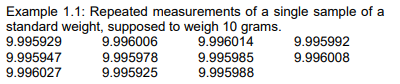
When we take multiple measurements of a person, animal, or object, we often get slightly different results. This can happen because of small imperfections in the measuring tool, slight differences in how we take the measurement, or natural variations between individuals. This unpredictable fluctuation is called random variation or random “error.” It’s crucial to recognize the potential causes of this variability.
The reading we actually get consists of the true value plus random variation. As a result, sometimes the reading will be slightly higher than the true value, and other times slightly lower. The size or direction of this deviation from the true reading, known as random variability, cannot be predicted for any specific observation. Random variability is considered independent of the true reading. The thing we’re measuring is referred to as a random variable.
If these measurements were weights from 11 different bottles, there would be an additional factor caused by variations in how the bottles are filled, as well as potential differences in the weights of the empty bottles. In such a scenario, these three sources of variation would be intertwined and impossible to distinguish from one another. In statistical terms, we would say that the three sources of variation are confounded.
Example 1.2 involves recording the weights of 4-month-old mice from 12 litters. From each litter, one male and one female mouse are chosen, and their weights, measured in grams, are documented.
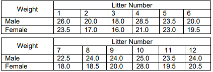
In this scenario, the variations in weights could arise from several factors: variances between different litters, variances between individual mice within each litter, distinctions between male and female mice, and potential errors in measurement.
These examples highlight some of the sources of random variability. Typically, there are numerous factors contributing to variations between observations, and it’s not always possible to isolate each one individually. However, it’s beneficial to identify and list the sources of variability before commencing a study. This can aid in designing the study and interpreting the results effectively.
The goal of statistical analysis is to identify patterns or deviations amidst the backdrop of random variability. For instance, we might aim to determine whether the average weight of male mice differs from that of female mice, or if female mice generally weigh less than males. Our conclusions hinge on factors like the disparity in mean weights and the variability within each gender group (as discussed later).
Identifying potential sources of variability before initiating your study is crucial. Once identified, efforts can be made to control or eliminate as many irrelevant sources of variation as feasible. This might involve standardizing equipment, providing training to observers, and other measures. Proper study design encompasses these steps to ensure robust and reliable results.
Measures of Central Tendency
Mean
The average of a set of numbers is also called the mean.
The MEAN weight of the male mice in example 2 is 23.25. It is found by adding the weights, and dividing by the number of male mice in the sample: x= [26 + 20 + 18 + 28.5 + 23.5 + 20 + 22.5+24+24+25+23.5+24]/12
Median
The mean provides a measure of “central tendency,” indicating the point around which the data is distributed. Another crucial measure of central tendency is the median. It represents the “middle” observation, positioned such that half of the observations fall above it and half fall below it. To find the median, the observations are arranged in ascending order, and the middle observation is identified. In cases where there is an even number of observations, the median is determined as the midpoint between the two middle observations.
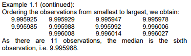
As there are 11 observations, the median is the sixth observation, i.e. 9.995988.
Continuing with Example 1.2, when arranging the weights of the male mice from smallest to largest, we get: 18.0,20.0,20.0,22.5,23.5,23.5,24.0,24.0,24.0,25.0,26.0,28.518.0,20.0,20.0,22.5,23.5,23.5,24.0,24.0,24.0,25.0,26.0,28.5
Since there are 12 observations, the median lies between the 6th and 7th observations, specifically between 23.5 and 24.0. Thus, the median weight is calculated as the average of these two values, resulting in 23.75.
The close proximity of the mean and the median for the weights of the male mice (23.25 and 23.75, respectively) suggests that the weights are distributed fairly evenly around the mean value. When the mean and the median differ significantly, it indicates that the distribution of the data around the mean is asymmetrical, indicating skewness.
Figure 1.1 depicts a histogram representing the weights of the male mice. Observing the histogram, we notice that there is one mouse with a weight falling between 18 and 19.9 grams, two mice with weights between 20 and 21.9 grams, and so forth. The interval with the highest frequency of mice is between 23 and 24.9 grams, with a total of 5 mice falling within this range. This highest peak in the histogram, representing the most common weight interval, is referred to as the mode.
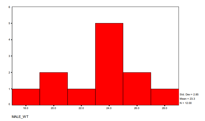
Figure 1.2 displays a histogram representing a skewed distribution. On the horizontal axis, we observe the values, while the vertical axis indicates the frequency of observations falling into each class. The histogram illustrates that the distribution is skewed, with a tail extending towards one side. Additionally, descriptive statistics are provided, including the standard deviation (2.85), mean (23.3), and sample size (N = 12.00). It’s noteworthy that the mean of these data is 3.45, while the median is 1.
While the mean is often the primary focus when analyzing data, it’s essential to consider the spread or variability of the data when drawing conclusions. Without understanding the spread, it’s difficult to determine whether differences between two means are significant or not. In other words, knowing the spread provides context for interpreting the differences observed in the means.
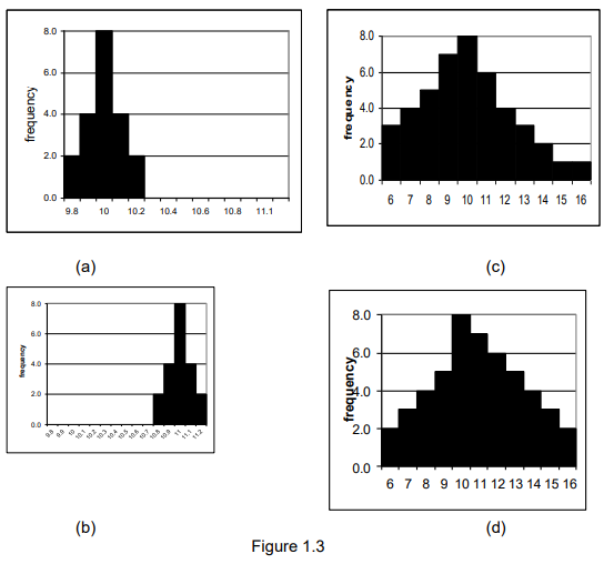
Indeed, simply comparing the means of two groups, such as one with a mean of 10 and the other with a mean of 11, doesn’t provide sufficient information to determine whether they are truly different. However, if the data for the first group predominantly falls within a narrow range, say between 9.8 and 10.2, and the data for the second group falls within a similarly narrow range, such as between 10.8 and 11.2, we might conclude that the groups are different. Conversely, if both groups exhibit a wide spread of data, for example, between 5 and 16, despite the difference in means, we would likely consider the groups to be similar.
Standard Deviation
The standard deviation is the most commonly used measure of spread. It’s calculated as the square root of the variance. The variance is determined by squaring the deviations from the mean (i.e., subtracting each value from the mean, squaring the result, and then summing these squares). This sum is then divided by the number of observations, �n, minus 1 (which provides good statistical properties). Consequently, the standard deviation of a sample provides insight into the spread of the observations around the mean.
The rationale for dividing by n−1 instead of n is that once we’ve calculated the mean, we’ve effectively used up one piece of information. Initially, we started with n separate pieces of information—the 12 weights of the male mice. However, once we have the mean, we’re left with n observations and one summary measure, which doesn’t provide additional knowledge. With any 11 of the weights and the mean, we can deduce the 12th weight. In statistical terms, we say that we’ve utilized one of our degrees of freedom. Hence, we have 11 degrees of freedom remaining to estimate the variance.
Interquartile Range
Another measure of spread is the interquartile range (IQR). The IQR is calculated as the difference between the upper and lower quartiles. The lower quartile represents the value below which 25% of the sample lies and above which 75% lies. Similarly, the upper quartile represents the value below which 75% of the sample lies and above which 25% lies.
Continuing with Example 1.2, when arranging the observations for the male mice from smallest to largest, we have: 18.0,20.0,20.0,22.5,23.5,23.5,24.0,24.0,24.0,25.0,26.0,28.518.0,20.0,20.0,22.5,23.5,23.5,24.0,24.0,24.0,25.0,26.0,28.5
With 12 observations, the lower quartile (Q1) represents the point below which 25% of the sample lies, and above which 75% lies. This is halfway between the 3rd and 4th observations, i.e., halfway between 20.0 and 22.5, or 21.25. Similarly, the upper quartile (Q3) is 24.5. Therefore, the interquartile range (IQR) is calculated as the difference between Q3 and Q1, resulting in 3.25 (obtained as 24.5 – 21.25).
Understanding Plots
Drawing visual representations of data is a fundamental aspect of statistical analysis because it provides insights and helps understand the data’s patterns. Visualizations offer a more intuitive understanding compared to simply looking at numerical values, even for small datasets where decimal values can be overwhelming. A graphical summary provides a better grasp of the data and allows for comparison with expectations. Therefore, visual examination of the data should be the initial step in any data analysis process.
Examining data graphically is also crucial for data validation. Ensuring data accuracy is paramount because drawing accurate conclusions relies on having reliable data. Nearly every dataset contains errors, whether from recording or typing mistakes, or inaccuracies in measurements. Therefore, graphical examination helps identify and address such errors, ensuring the integrity of the dataset and the validity of subsequent analyses.
Histogram
The histogram is one of the simplest graphical representations of data. To construct it, we start by determining the range of the data, which is calculated as the difference between the largest and smallest values (i.e., the maximum minus the minimum). Next, we divide this range into a suitable number of intervals, typically around 10, although this may vary based on the number of data points. Then, we count the number of data points falling within each interval. Finally, we draw a picture where the intervals are displayed on the horizontal axis, and the frequency of observations is represented on the vertical axis.
In Example 1.3, we examine advertised prices for statistics books published by Wiley several years ago. The prices, rounded to the nearest dollar, are as follows:
53,65,75,45,52,63,60,55,75,60,65,60,55,45,67,55,72,70,85,33,58,50,55,65,70,75,60,75,68.53,65,75,45,52,63,60,55,75,60,65,60,55,45,67,55,72,70,85,33,58,50,55,65,70,75,60,75,68.
Given the 29 numbers, it’s appropriate to use 6 intervals for the histogram. These intervals span from 30 to 39, 40 to 49, and up to 80 to 89. This results in the histogram depicted in Figure 1.3. In this histogram, we observe 1 observation in the class interval 30 to 39, 2 observations in the interval 40 to 49, and 8 observations between 50 and 59. The distribution of observations appears reasonably symmetrical, with no outliers far from the center.
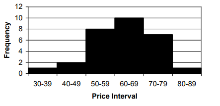
These data points represent a subset of the book prices advertised. If all 67 prices were plotted, it would become evident that nearly all prices fall between $30 and $99, with only three outliers: $123, $189, and $1110. To accommodate the value of $1110, the chosen scale would likely need to be in hundreds of dollars. Consequently, the histogram would reveal a peak in the first class, two observations between $100 and $199, followed by a significant gap, and finally the single observation at $1110.
Indeed, observations that deviate significantly from the rest should be scrutinized thoroughly. While they may not necessarily be incorrect, they do stand out from the rest of the data. Data validation is crucial, as no amount of statistical analysis can compensate for poor or mistyped data. In the case of the $1110 price, it corresponds to the Encyclopedia of Statistical Sciences, which comprises 10 volumes. Understanding such outliers prompts important questions about the nature of the data being analyzed—are we examining book prices in general, or specifically prices of single-volume books? It’s worth noting that the second highest price is for a two-volume book, while the third highest price is for a single volume, albeit one that is significantly overpriced.
Using an alternative approach, we can plot the histogram with the scale on the vertical axis and the number of observations on the horizontal axis. This results in the plot depicted in Figure 1.5 for the subset of book price data.

Stem and Leaf
A slightly more advanced type of histogram is a stem and leaf plot. This plot aims to provide additional information compared to a histogram while maintaining the overall clarity. Instead of marking an observation with an ‘x’ as in a histogram, each observation is represented by a number. For instance, with the book price data (e.g., 53 and 68 dollars), instead of placing an ‘x’ next to 50 and another ‘x’ next to 60, we place a 3 next to the “stem” 5 and an 8 next to the “stem” 6. Examining the resulting stem and leaf plot (Figure 1.6), one can still discern the overall structure while easily identifying additional details, such as one observation at 33, two at 45, one at 50, one at 52, one at 53, and four at 55, and so on.

Finding the right scale for a plot often involves experimenting with different options to achieve clarity. It’s crucial to keep the plot fairly simple because too much detail or excessive sprawl can obscure the overall picture. The aim is to discern whether the data form a single group or multiple groups, identify the center of the data, assess the tightness or spread of the data, detect irregularities that may indicate data entry errors, and evaluate the symmetry or asymmetry of the data distribution. Asymmetrical data may manifest as outliers far from the bulk of the data or as a long tail in the distribution, with a steadily decreasing number of observations in the higher categories. Such distributions are often labeled as having a long right tail. Data in the form of counts, biological measurements, income, or prices frequently exhibit skewness and a long right tail. Further discussion on this topic will follow later.
Box Plot
When dealing with a large amount of data, histograms or stem and leaf plots may become less practical. In such situations, a summary plot like the box and whisker plot can be more effective. This plot, depicted in Figure 1.7, provides a concise summary of the data’s distribution, including key statistics such as the median, quartiles, and potential outliers.
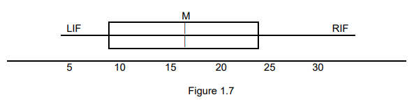
In a box and whisker plot, the leftmost vertical line represents the lower quartile, indicating the observation below which 25% of the observations lie. Similarly, the rightmost vertical line represents the upper quartile, indicating the observation above which 25% of the observations lie, or below which 75% lie. The middle vertical line denotes the median, representing the point above and below which 50% of the observations lie. The lines extending out to the right and left are the “whiskers,” which extend to the maximum and minimum observations. In some cases, particularly when there are outliers in the data, the whiskers may extend only to a certain distance, such as one and a half times the median, and observations beyond the whiskers are plotted as separate points. Additionally, the position of the mean can be included on the plot to assess the skewness of the data distribution.
Indeed, the box and whisker plot becomes particularly useful when dealing with observations from multiple groups. In such cases, one can draw separate box and whisker diagrams for each group and display them next to each other. This approach facilitates visual comparison between the groups, making it easier to discern differences in their distributions and identify any potential patterns or trends across the groups.
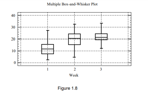
In Figure 1.8, we see a multiple box and whisker plot representing data from various scenarios:
- The weights of animals or people during their first three weeks of life (scaled accordingly).
- The volume of cold drinks sold (in hundreds of liters) during the last three weeks of December.
- The prices of an industrial share on the Johannesburg Stock Exchange (JSE) over three consecutive weeks.
- The combined rating on four aspects of a product over three weeks, tracking the progress of an advertising campaign.
- The number of deaths per month, categorized by sex and province.
(Note: “Sex” refers to biological distinctions between males and females, while “gender” is a social concept. However, due to internet filtering, data providers often use terms like “gender” instead of “sex” in their tables.)
More Examples
Here are some additional examples:
- Salary versus years of schooling.
- Planned expenditure on a new car versus salary.
- Prices of industrial shares versus the all-share index.
- Opinions on two related issues.
It’s important to always include scales on plots. Additionally, plots intended for comparison should be on the same scale. This means the axes of the graphs you want to compare should extend to the same values, and the scales of the data should be consistent.
There are various ways to enhance the graphical representation of your data. You can use colors to differentiate between different groups or use different symbols (like circles for males and triangles for females). It’s often beneficial to include multiple plots on the same page or opposite pages. For example, you can arrange plots of responses for males on the left and females on the right, with plots for low-income groups at the top and high-income groups at the bottom. Similarly, you can place plots for different species next to each other, arranging them with plots for immatures at the top, females in the middle, and males at the bottom.
Graphical displays are essential for understanding and verifying data. They also help communicate results effectively to colleagues, supervisors, or examiners. Whenever possible, graphical displays should be the initial step in the analysis process.
Types of data
So far, we’ve discussed “data” in general terms. However, it’s often helpful to categorize data into different types when determining the most suitable analysis method. The classification of data into types isn’t always straightforward, and some data may fall into more than one category.
Data is primarily categorized into discrete and continuous types:
Discrete data are values that can only take on specific values or codes. Examples include yes or no responses, categories like green, semi-ripe, ripe, and over-ripe, or numerical values such as 1, 2, 3, and so on.
Continuous variables, such as temperature or share price, can theoretically take on any value within a specified range.
Discrete data can be further divided into binary, categorical, and ordinal data based on the scale of measurement:
- Binary data are on the simplest scale, consisting of only two categories. Examples include yes/no responses, success/failure outcomes, whether an activity was observed or not, or whether a share transaction occurred or not.
The categorical scale is used when data are divided into more than two categories. Examples of categorical variables include:
- Eye colors like blue, brown, gray, or black.
- Different species or subspecies of animals, insects, or plants, such as various types of bucks, grasshoppers, or pine trees.
- Various types of financial shares, like industrials, mining, etc.
- In market research, different stores that respondents have shopped at.
In some cases, there may be an implicit order among the categories, such as mist, fog, drizzle, light rain, and heavy rain; or desert, savanna, bushveld, and forest. When there’s an implied order in discrete data, it’s termed ordinal data. However, this ordering doesn’t imply a true scale. For instance, we can’t quantify that savanna has twice as much ground cover as desert and bushveld three times as much. The ordering is more qualitative.
Other examples include ranking four products or measures of share volatility or responding to questions on a scale like disagree strongly, disagree, agree, and strongly agree. In such cases, each respondent may interpret terms like “strongly” differently, and the scale may not be neatly divided into equal segments. Despite this, we often treat such data as if it were on a continuous scale, assuming that most people use an equally spaced scale, with the ends of the scale related to strong feelings relative to their personalities.
When data can be assigned a scale, it falls under the category of numerical scale data. Examples of such data include count data, such as:
- The number of students passing a statistics course.
- The number of people agreeing with a statement.
- The number of beetles in a dung pat.
- The number of shares sold.
Other examples of numerical scale data include:
- Temperature measured in degrees Celsius.
- Weight or height.
- Amount spent.
- Amount traded on the JSE or the value of a share.
These two sets of examples represent different types of data. Count data, such as the number of students passing a course or the number of shares sold, are inherently discrete because they can only take integer values (1, 2, 3, 4, and so on). On the other hand, data like temperature measurements can theoretically take on any value within a range, making them examples of continuous data.
In practice, when count data can encompass a fairly large number of categories, typically 10 or fewer, it’s often treated as approximately continuous and analyzed accordingly.
Indeed, questionnaire data often follows a categorical scale, such as a five-point scale ranging from “agree strongly” to “strongly disagree,” or a three-point scale like “agree,” “neither agree nor disagree,” and “disagree.” Similarly, more subjective measures like assessing temperature as “cold,” “cool,” “warm,” or “hot” may also be treated as continuous data in certain analyses. Despite being discrete in nature, these types of data are often analyzed as if they were continuous for practical reasons and to simplify statistical analyses.
Data on a numerical scale can be further divided into interval and ratio scale data. The primary distinction between them lies in the presence of a natural zero measurement on the ratio scale, such as zero dollars or zero age. In contrast, the zero point on an interval scale is defined arbitrarily. For instance, zero degrees temperature holds different meanings for the Fahrenheit and Celsius scales.
Despite this difference, the same analytical methods are applied to both scales.
It’s crucial to recognize a fundamental distinction between categorical or binary data and other types of data. For categorical or binary data, it’s inappropriate to calculate the mean; instead, one should focus on proportions. For instance, consider a scenario with 100 individuals, where 86 are females (coded as 1) and 14 are males (coded as 2). The mean for the variable “sex” in this case would be 1.14. However, it doesn’t imply that the average person is 86% female and 14% male.
Similarly, for categorical variables like race, the specific coding scheme shouldn’t affect the interpretation. Whether you code races as 1, 2, 3, 4 or as 4, 2, 3, 1, the underlying meaning remains unchanged. This principle also applies to other categorical data sets like sectors of the stock exchange, species or subspecies of animals or plants, different provinces, and so forth.
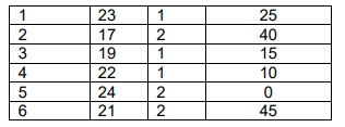
When analyzing data using computer packages, it’s typically necessary to input each observation in a separate row within a spreadsheet, where the variables constitute the columns. For instance, consider the following data:
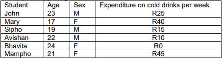
To input this data into the software package, you would need to convert “student” to student number and “sex” to numerical values, like 1 for M and 2 for F, or vice versa. This recoding is necessary because some software might not accept letters like M and F for all analyses. Therefore, the data would be structured with column headings as “Number,” “Age,” “Sex,” and “Expenditure,” and the actual data entered as follows:
In the upcoming chapters, we’ll work under the assumption that the data is interval-scaled. This approach allows us to introduce the necessary concepts for hypothesis testing. Later on, we’ll demonstrate how these concepts extend to apply to discrete data as well.
Types Observations
Independent and Dependent Variables
Observations are considered independent when the result of one observation doesn’t provide any insight into the expected outcome of another observation. For instance, if you’re measuring the heights of a randomly selected group of people, finding out that the first person is short doesn’t give you any clues about the height of the second person. Each measurement is taken without influencing or being influenced by the others.
Indeed, in cases like hourly or daily temperature readings, there’s a noticeable pattern: daytime temperatures tend to be higher than nighttime temperatures, and summer temperatures are typically warmer than winter temperatures. So, if you record a high temperature initially, it’s likely that subsequent readings will also be high. This interdependence among observations is termed dependence or autocorrelation, meaning that each observation is linked to previous ones. Financial data commonly exhibit this autocorrelation pattern.
When discussing variables and observations, it’s important to distinguish between the two. Variables represent the different aspects being measured, while observations are the individual instances or items being studied. Here are some examples:
- Animals’ Dimensions: Variables include height, weight, age, and nose-to-tail length, while observations refer to the individual animals in the study.
- Chemical Constituents of Soil: Variables are chemical properties like pH, calcium (Ca), magnesium (Mg), and sodium (Na), with observations being the various soil samples collected.
- Questionnaire Responses: Variables encompass different questions asked in a survey, like product ratings or opinions on various topics, along with demographic data such as age, smoking habits, and previous illnesses. Observations correspond to the respondents who answer these questions.
- Share Prices: Here, observations are the specific days on which data is collected, and variables are the different shares whose prices are recorded on each day.
Scientific Inquiry

The scientific method involves a systematic approach to investigating phenomena. Here’s how it typically works:
Formulating Hypotheses: Researchers start by developing hypotheses, which are educated guesses about how variables are related or how a phenomenon works.
Data Collection: Next, researchers gather data through observations, experiments, surveys, or other methods. The data collected should be relevant to testing the hypotheses.
Analysis: Researchers analyze the collected data using statistical methods and other analytical techniques to determine if the data supports or refutes the hypotheses.
Interpreting Results: Based on the analysis, researchers interpret the results to draw conclusions about the hypotheses. They consider factors such as statistical significance, effect size, and practical significance.
Revision and Further Study: If the hypotheses are supported, researchers may refine or update them based on the findings. If the hypotheses are not supported, researchers may revise them or develop new hypotheses for further investigation.
Confirmation: Once initial findings are promising, researchers may conduct additional studies to confirm the results. Confirmation studies help establish the reliability and validity of the findings.
The scientific method is an iterative process, with each step informing the next. It emphasizes objectivity, rigor, and systematic inquiry to advance knowledge and understanding in various fields
Let’s say we’re interested in studying the impact of a new educational program on student performance, particularly focusing on test scores. Initially, we might hypothesize that if the program is effective, we should observe a significant improvement in test scores among participating students. However, analyzing test scores alone might not provide a clear picture for various reasons. For instance, the effectiveness of the program might not be directly reflected in test scores due to other factors influencing student performance, such as socioeconomic background or individual learning styles. Additionally, factors like test anxiety or difficulty might affect scores regardless of the program’s impact. Moreover, the way test scores are recorded and reported could vary across schools or districts, leading to inconsistencies in the data. Given these complexities, we may need to revise the hypothesis to consider alternative measures of academic achievement, such as classroom engagement or long-term academic outcomes like graduation rates. Alternatively, we might adjust the hypothesis to include qualitative data from student interviews or teacher observations to gain a deeper understanding of the program’s effects beyond test scores alone.
Steps in Practice
- Initial Hypothesis: Expectation of observing improved test scores due to the new educational program.
- Analyzing Test Scores: Examination of test scores might not provide a clear indication of program effectiveness due to various influencing factors.
- Challenges in Test Score Analysis:
- Other factors (socioeconomic background, learning styles) may influence student performance.
- Test anxiety or difficulty could impact scores independently of the program.
- Inconsistencies in data recording and reporting across schools or districts.
- Revised Hypothesis: Consideration of alternative measures of academic achievement beyond test scores.
- Potential Adjustments:
- Inclusion of measures like classroom engagement or long-term academic outcomes.
- Integration of qualitative data from student interviews or teacher observations.